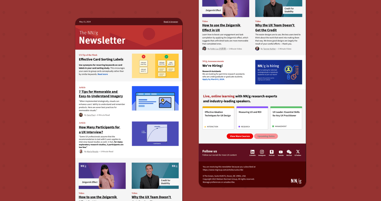
NN/g Newsletter Redesign
Transforming the NN/g Newsletter into an action-oriented hub to better inform subscribers about the latest and greatest NN/g content.
Problem
The current newsletter lacks insights, stronger ties to offerings, and distinct NN/g branding.
Despite Nielsen Norman Group's extensive offerings, including deep research and expert advice, readers are unaware of these resources, missing opportunities to enjoy all that NN/g has to offer.
Competitor Analysis
What makes other newsletters so great?
Before I joined this project, research was conducted by one of NN/g’s former UX Specialists, Samhita Tankala, who lead this project. To start off, I received the research and examples of successful newsletters, along with insights into aspects that could inspire the redesign.
Branded designs
The Skimm and The Washington Post have eye-catching branded headers, which allow their newsletters to stand out from other emails.
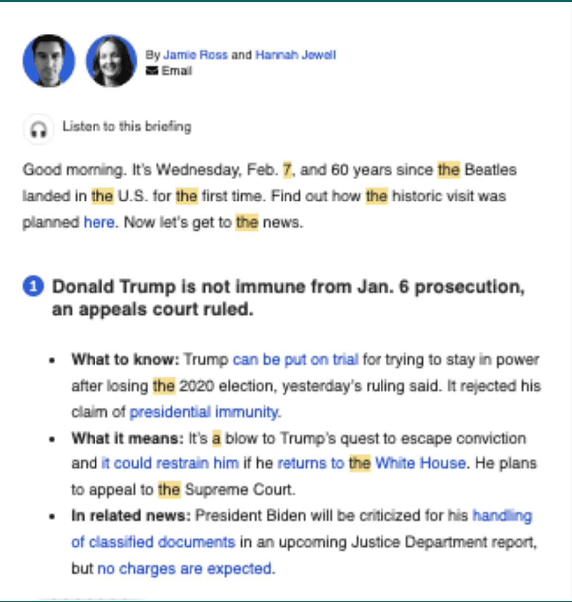
Takeaways at a glance
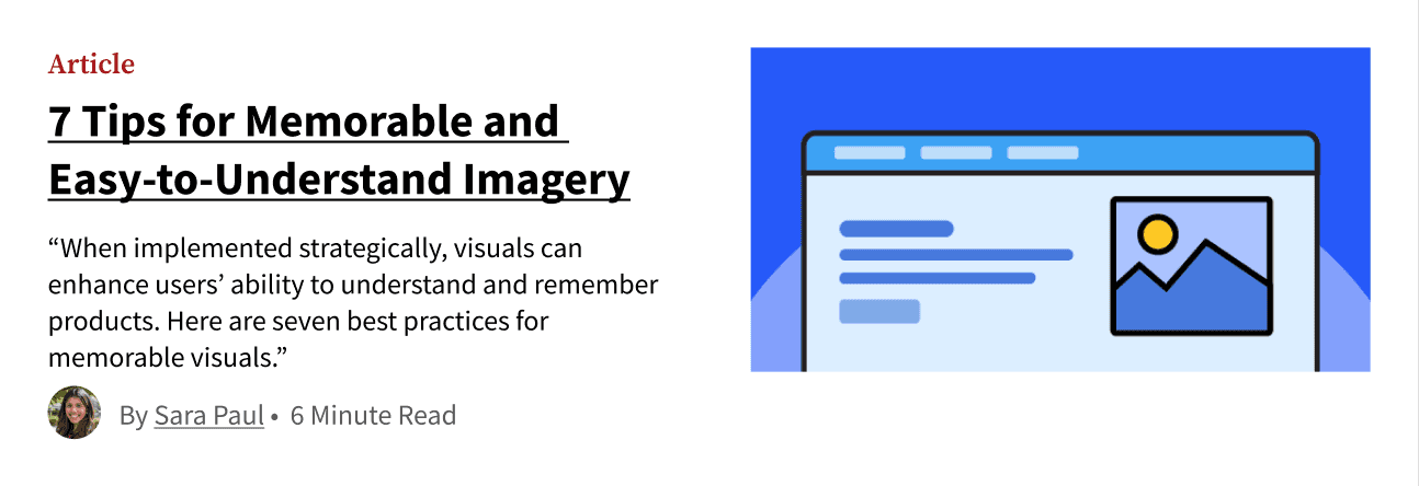
The Washington Post for example breaks down each piece of content, allowing users to have a takeaway
with each.
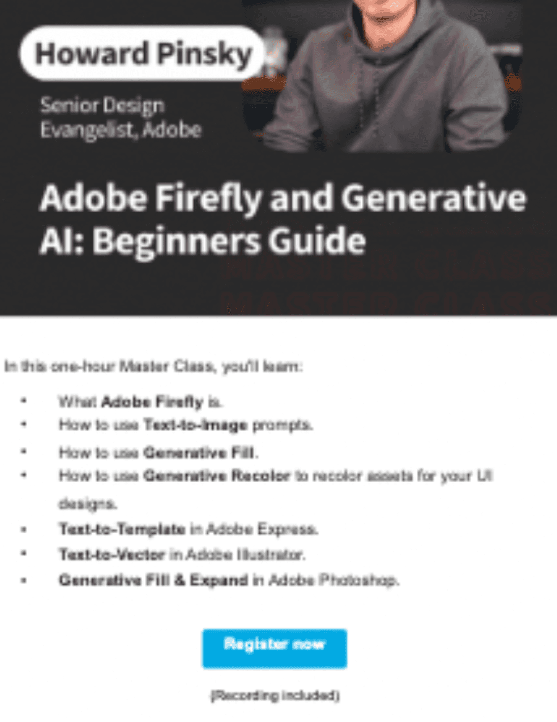
Showcasing other offerings
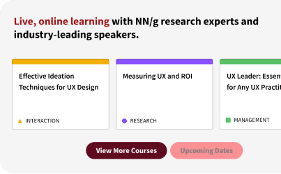
IDEO gives events and other offerings calls to action and prominence, ensuring they are noticed and engaged with.
Design Phase 1
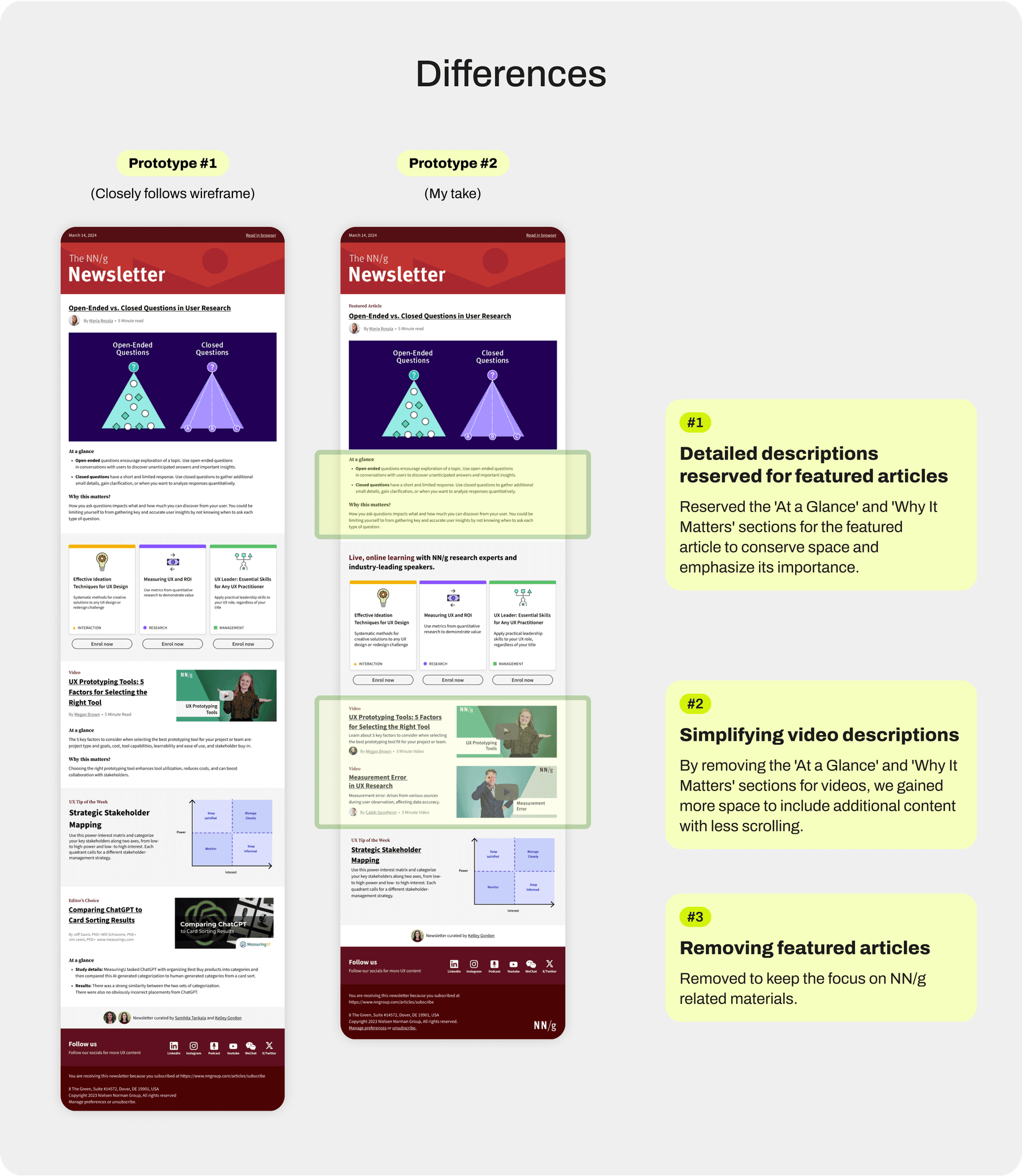
Interpreting someone else's vision.
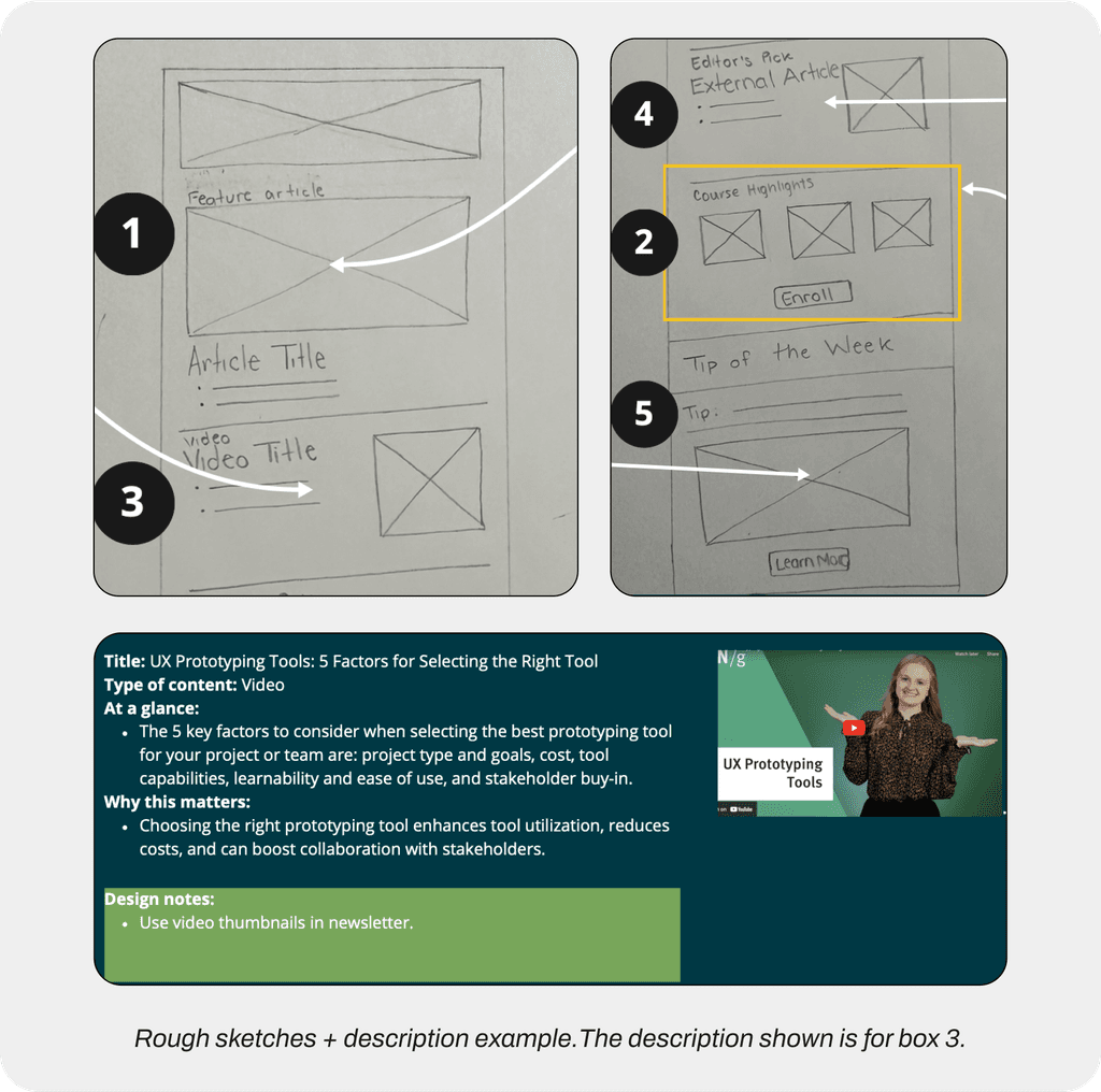
I was given initial rough sketches and notes on how the newsletter to work off on. While I agreed with most of the design choices, I had a few concerns about the presentation and content.
Concerns
Lengthy descriptions.
The aim of the "At a Glance" and "Why this matters", was to provide instant value and insights. However, I was concerned it might deter readers from engaging with the entire newsletter, as the sections could become lengthy if used more than once.
Not enough content.
Although the variety of content has increased, the amount of articles and videos have decreased. Which may reduce the newsletter’s value since different readers will be looking out for different topics.
External articles are irrelevant.
NN/g newsletter readers are subscribing for NN/g-specific content. I fear that providing external sources will direct people away from their offerings.
Compromising by providing choices.
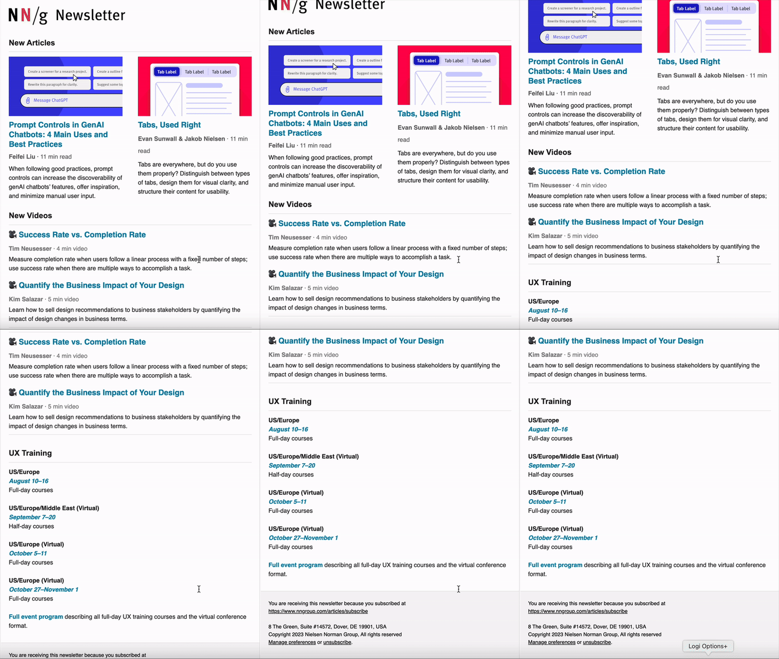
Despite my concerns about the low fidelity wireframes, I acknowledge the extensive research and consideration that went into it. Rather than producing a single iteration, I created two versions: one closely aligned with the sketches and one incorporating my own ideas. This approach allowed me to start a conversation about possible improvements to the design.
User Testing
Subscribers value more content over descriptions.
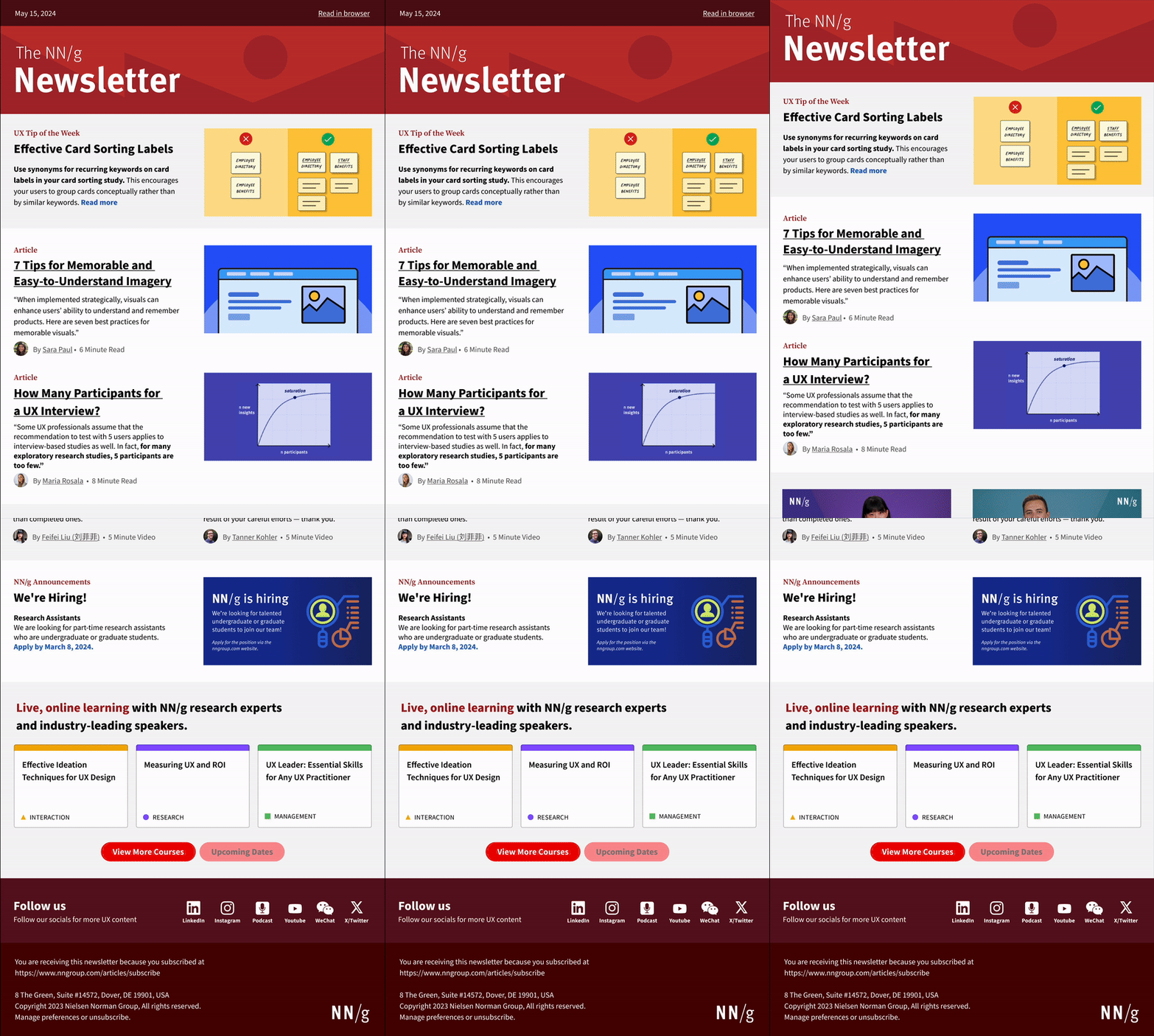
We conducted an A/B test with two versions. Users were given tasks to complete on the prototype. Over half of the participants preferred Prototype #2, as it provided more content with less scrolling.
“my preference is to have more resources because again, like the main purpose of this. It's almost like a digest..”
Takeaways
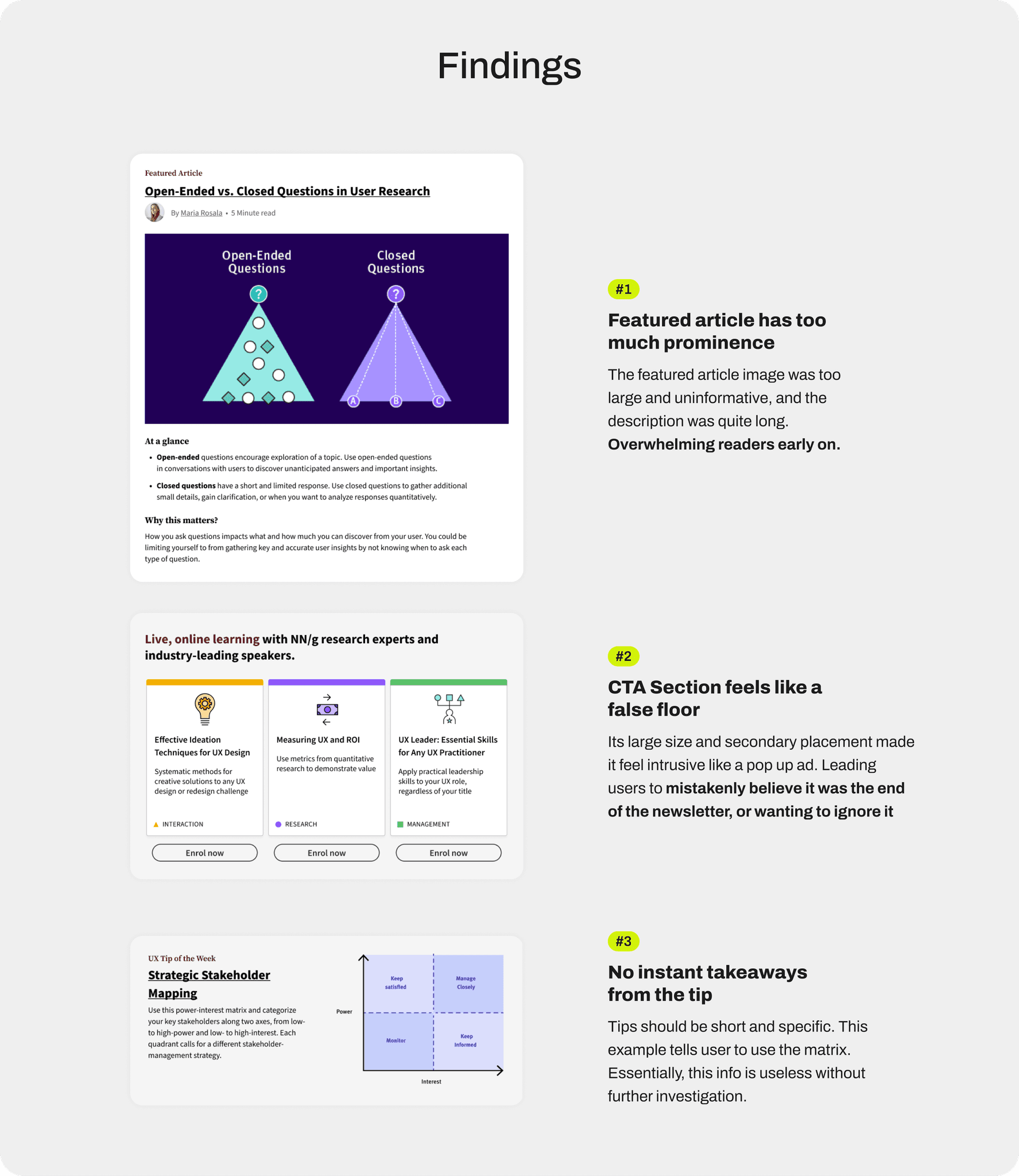
Users are not reading the whole newsletter.
The biggest takeaway from the first round of user testing is that users are not reading the entire newsletter, as they expect the majority of the content to be above the fold. Anything below that often goes unnoticed, which gave the team two main things to consider...
Considerations
How to add value, without losing value?
Many felt that featuring only one article made the newsletter seem less valuable, as they expected more content. Our efforts to add value by expanding descriptions and including more information for each description had the opposite effect, making the newsletter feel overwhelming. This feedback prompted us to rethink how we could refine our copy to be concise yet still informative.
Importance of space optimization and order.
This round of user testing made us more aware of the space each content block occupies and its placement within the newsletter. For example, the CTA section promoting upcoming online learning courses was criticized for being too large and appearing too early, which overwhelmed users. This feedback highlighted the need to deliver necessary information in a more compact format while optimizing the content order.
Design Phase 2
Short and sweet actionable.
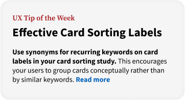
We received feedback that the UX Tip of the Week needed more concise descriptions to maximize space and improve scanning.
Unnecessary over-explaining
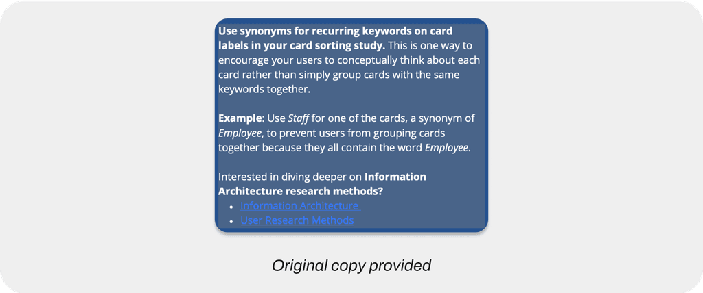
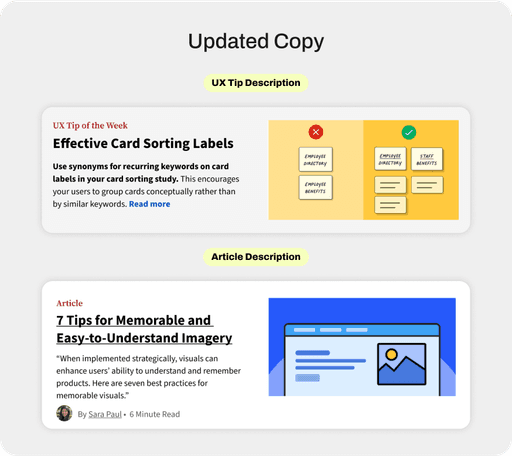
In previous iterations the copy for the descriptions were broad and unfocused, making concepts easy to miss on first read. This is evident below in which the tip spans 2 paragraphs and requires a written example to fully grasp the concept. Effectively making this section hard to scan.
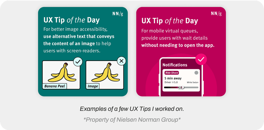
When looking for ways to improve this copy, I drew inspiration from the UX tips I created for the NN/g Instagram page. This was particularly challenging because, in addition to the design work, I had to take full articles and condense them into bite-sized, digestible content. These tips are effective because they deliver key messages instantly by using focused language and visuals to enhance comprehension.
I applied this same design approach to the article and video descriptions in the newsletter, keeping everything short and actionable, which is pretty sweet.
Takeaways
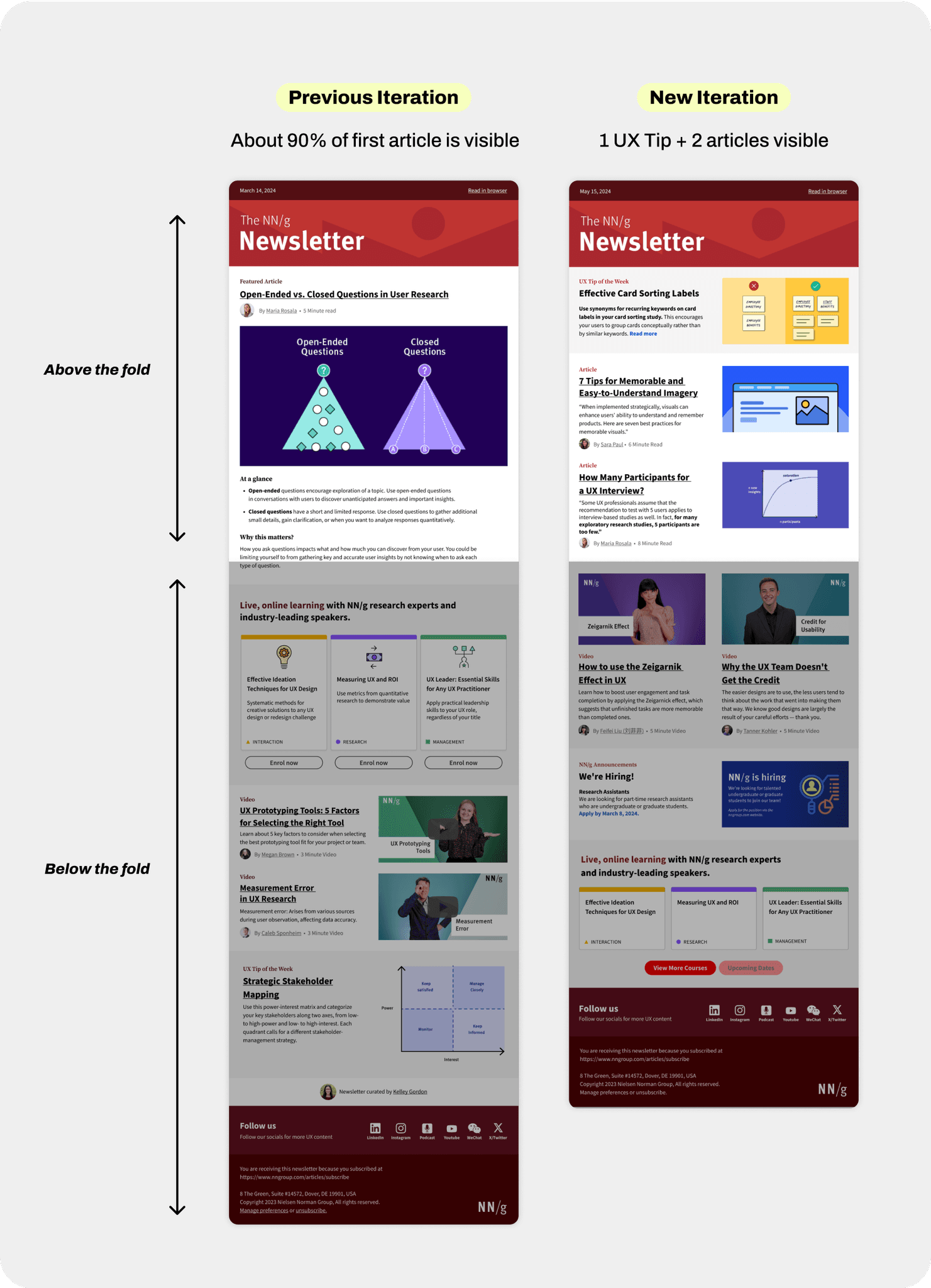
Optimizing space, improved the flow and order of the newsletter.
By shortening the article descriptions, we were able to present more content above the fold, allowing users to view three pieces of content without needing to scroll. This change also gave us the confidence to reposition the live learning section at the bottom, as we believe that the pattern we established will encourage users to scroll to the end, reinforcing their expectation of discovering valuable content throughout the newsletter.
Reflection
Some things I learned...
It’s okay to leave some things to be discovered.
Providing everything can overwhelm users; it’s more effective to highlight key components that hook them, encouraging further exploration on their own.
The power of writing in UX.
This project showed me the importance of UX writing—not just for conveying information, but for enhancing the user experience by prompting exploration. In a newsletter, every piece of text should inform while encouraging further engagement.
It’s okay to disagree with design choices.
I was initially hesitant to voice concerns about certain choices. To my surprise, my team was receptive, and my suggestions actually sped up the process by identifying potential issues early on.
